Bedrock Property Solutions
Year
2022
Platform
Deliverables
- Condensed content
- Fully-responsive site
- Creative copywriting
Brief
Bedrock Property Solutions (BPS) approached us with the intention of rebranding their growing business, in order to update their position in the market.
The Steps
- Recreate brand identity
- Design website layout
Solution
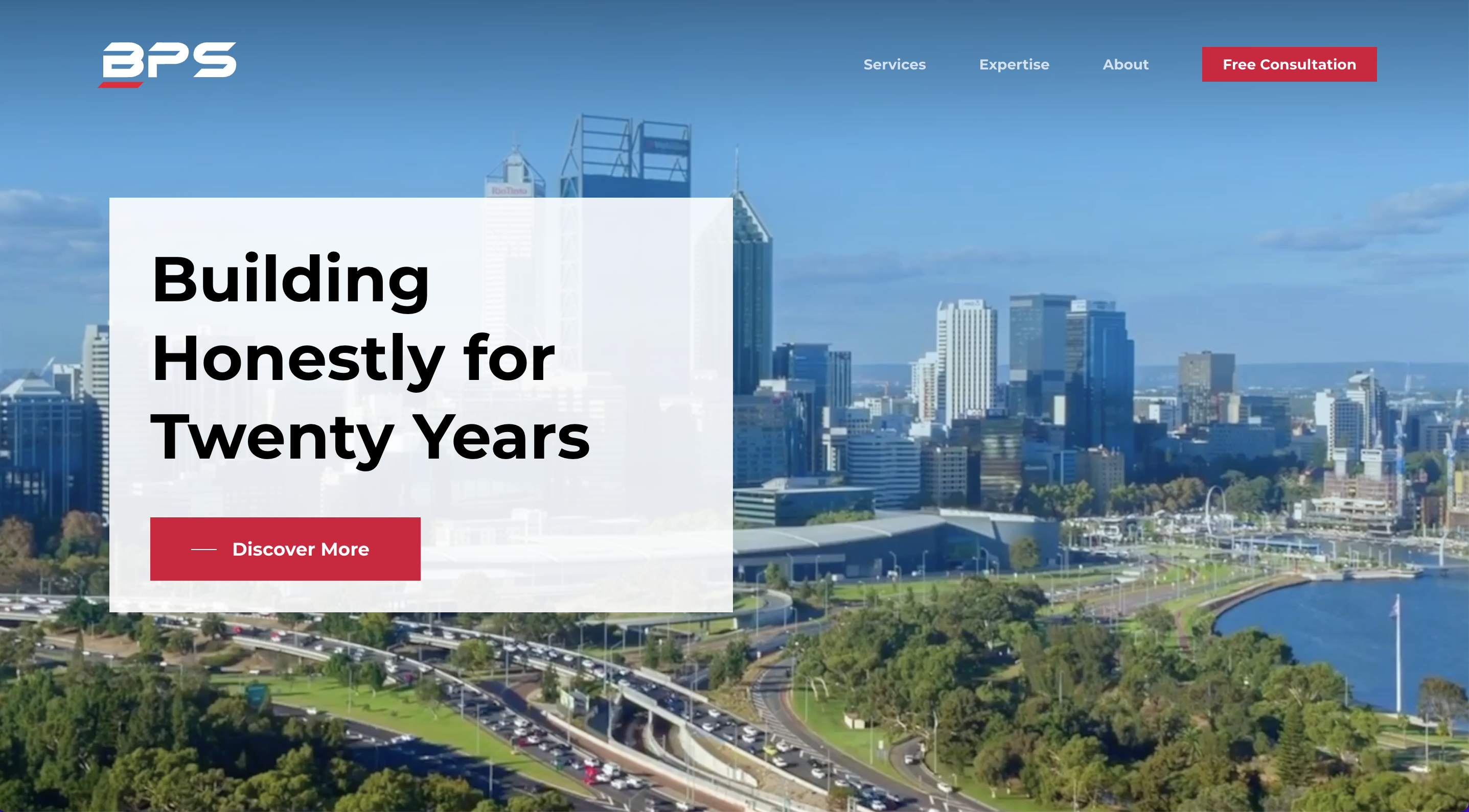
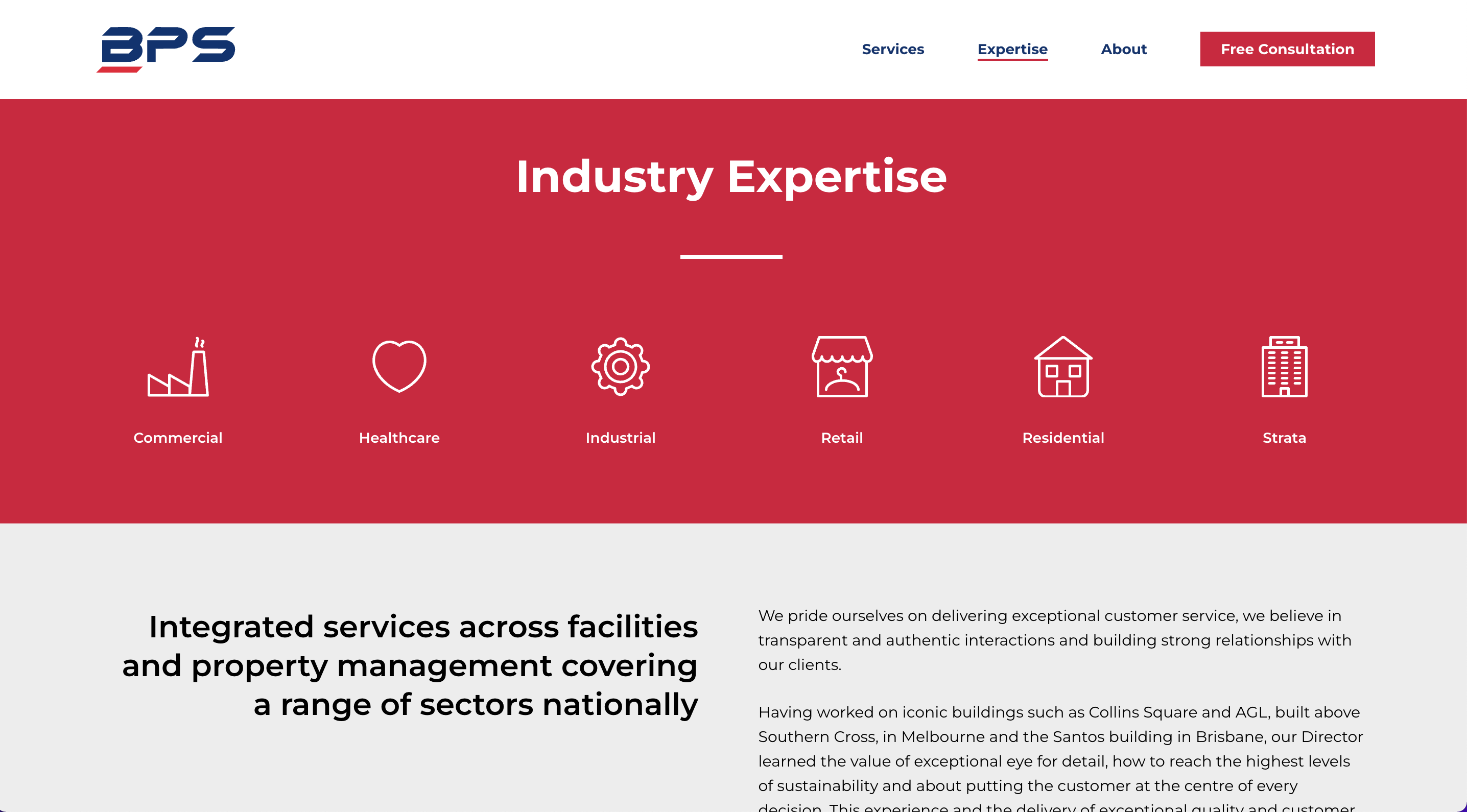
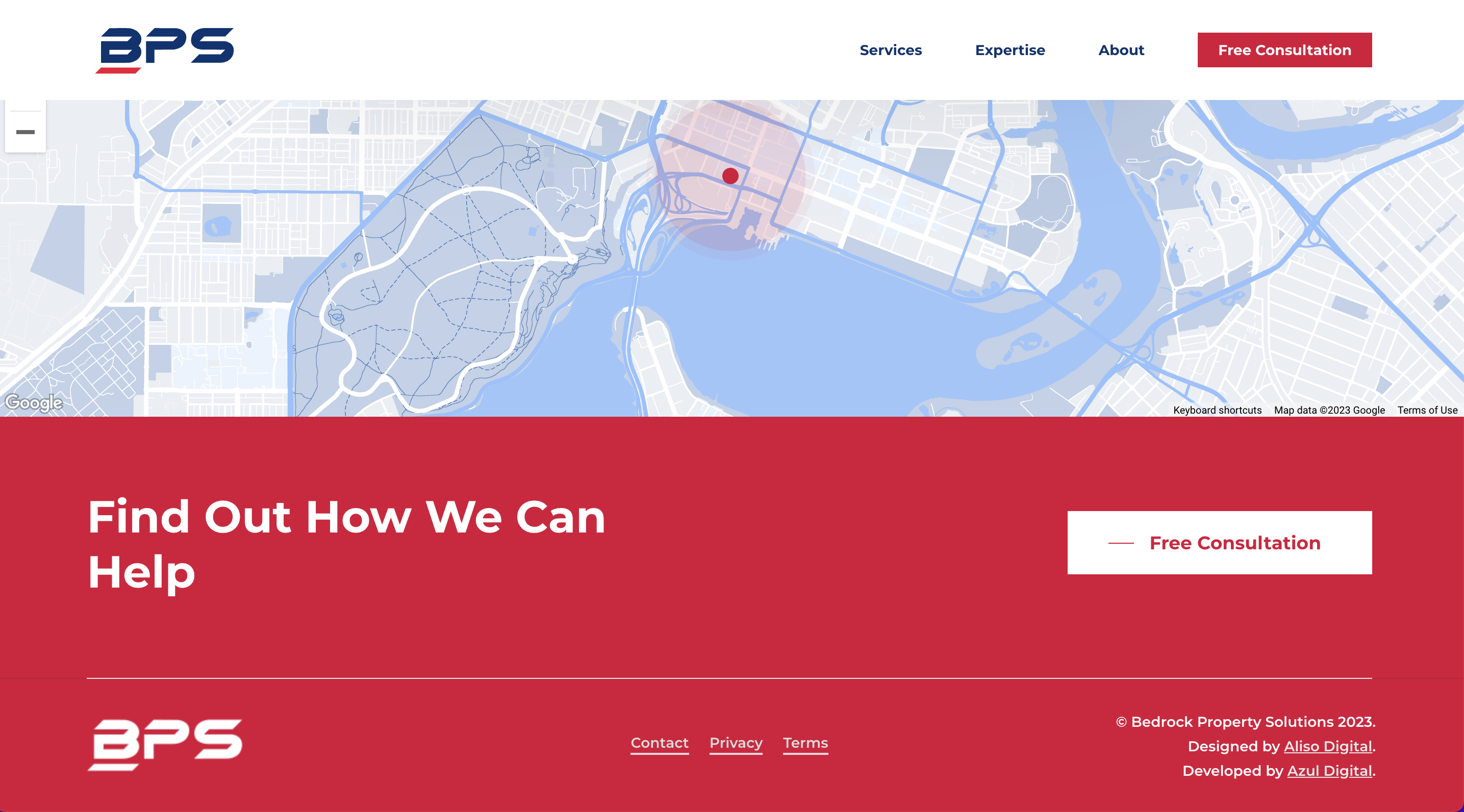
Our team decided to create a brand new look for BPS, focusing on the status attributed to property valuation (the service offered by BPS). The existing website was a hefty 20+ pages, and so was consolidated to make the reading experience more pleasurable. In order to make the business more personal, call-to-action points are front-and-centre, to grab visitors’ attention.
Colour palette
It was important to choose recognisable, corporate-styled colours for the palette, while also bringing across a sense of BPS’s vibrant personality.
Deep Blue
#003472
White
#ffffff
Crimson
#f00032
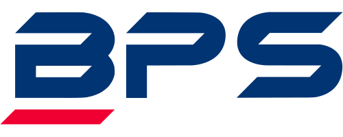
Wordmark
The first format is the primary format, used for the majority of branding. The symbol is used for smaller elements, such as icons.
From the Client
“The site that Azul put together has helped us reintroduce our growing brand to the Western Australia market”
Outcome
BPS now have a new brand and easy to use website that positions themselves as leaders in their market. As a result, the website helps support new leads and opportunities.
